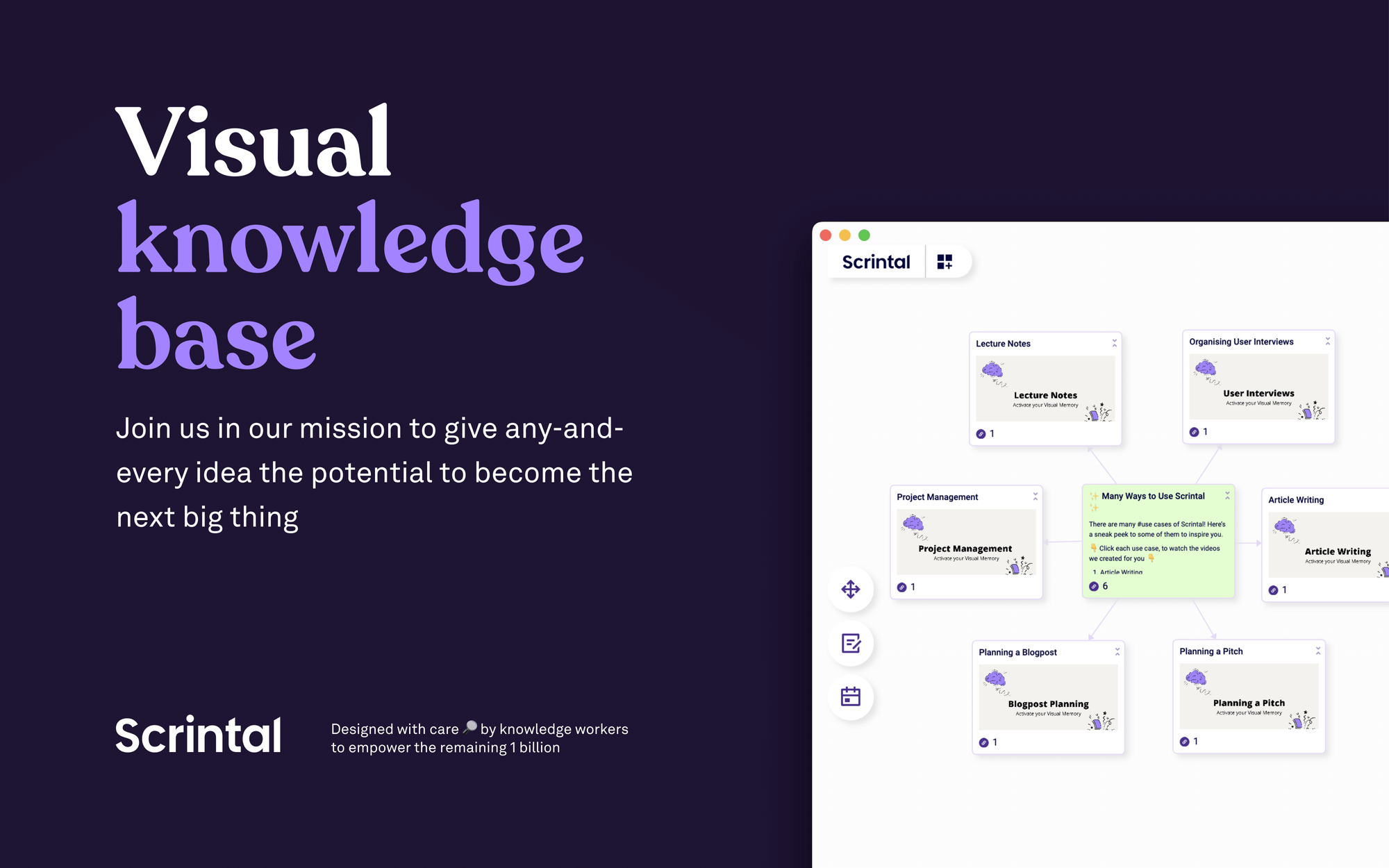
Scrintal’s 19-slide Deck that Raised €1M
Scrintal's deck raised €1M with stunning design and storytelling.

Background
- Company: Scrintal, founded in 2020, is a digital platform enhancing creative potential for creators like writers, researchers, and entrepreneurs.
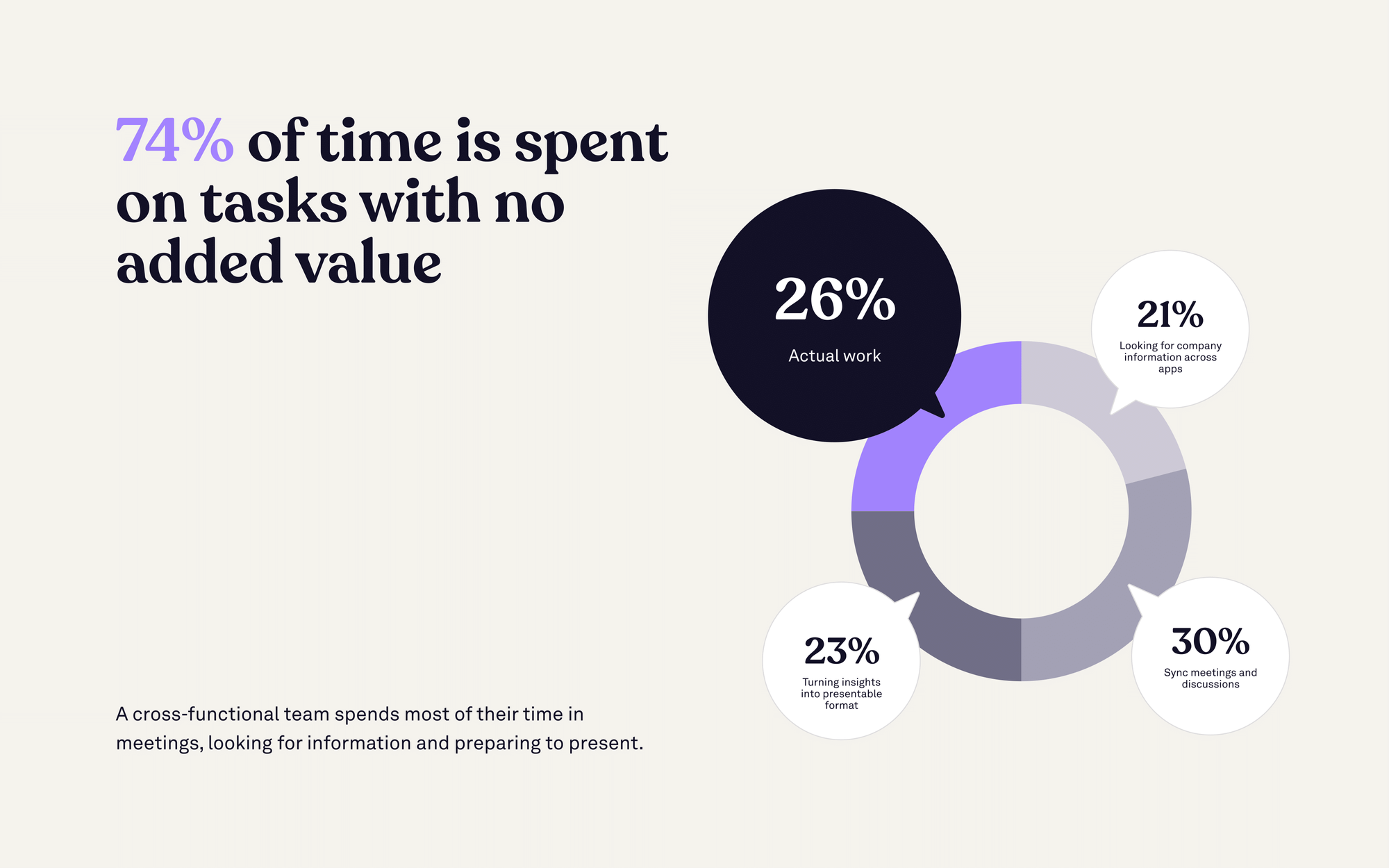
- Problem: 74% of time spent by cross-functional teams brings no added value to a project or idea.
- Solution: They offer a visual note-taking and mind mapping tool for organizing and connecting thoughts.
- Most Recent Funding: €1M on January 18, 2023
- Total Funding: €1M
- Notable Investors: Icebreaker.vc and Spintop Ventures
Bottom Line
Form and Function
- Scrintal's deck stands out with its stunning design.
- Despite containing a wealth of information, it effectively captures investors' attention prior to a live pitch.
Clarity
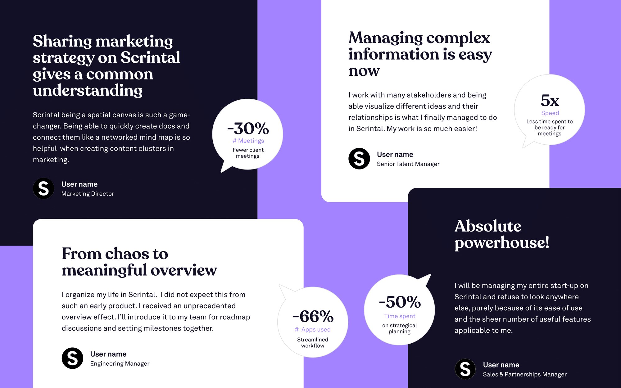
- A detailed examination of the problem leads to a clear value proposition, supported by user testimonials.
- The Scrintal team even manages to address the competitive landscape early on in the value proposition slide.
Storytelling
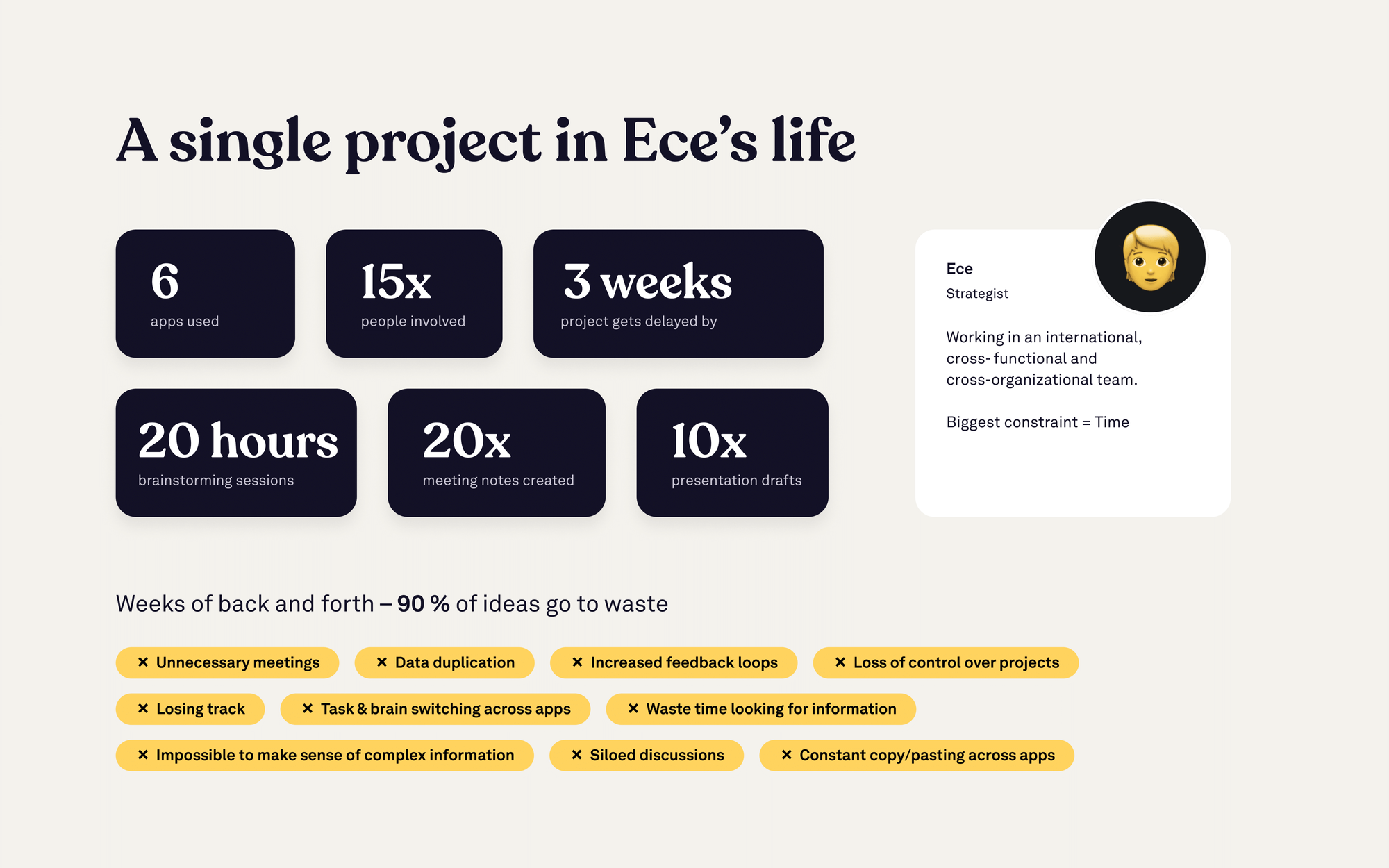
- The deck's storytelling begins right from the start, introducing Ece's user persona and carrying the narrative throughout.
- Although the team slide is absent, the other slides masterfully convey the problem, solution, and value proposition in a clear and captivating manner.
- Scrintal's remarkable traction, revenue growth, and customer retention metrics provide solid evidence of the company's success.
The Deck
Cover Slide
Problem
Problem Cont.
Solution
From experience using Scrintal, a demo would be a great thing to add in the solution section. The app is such a shift from Notion, Docs, and task management apps that it’s hard to wrap your head around. Once you experience the app, there’s an “aha” moment.

Solution Cont.
Value Proposition
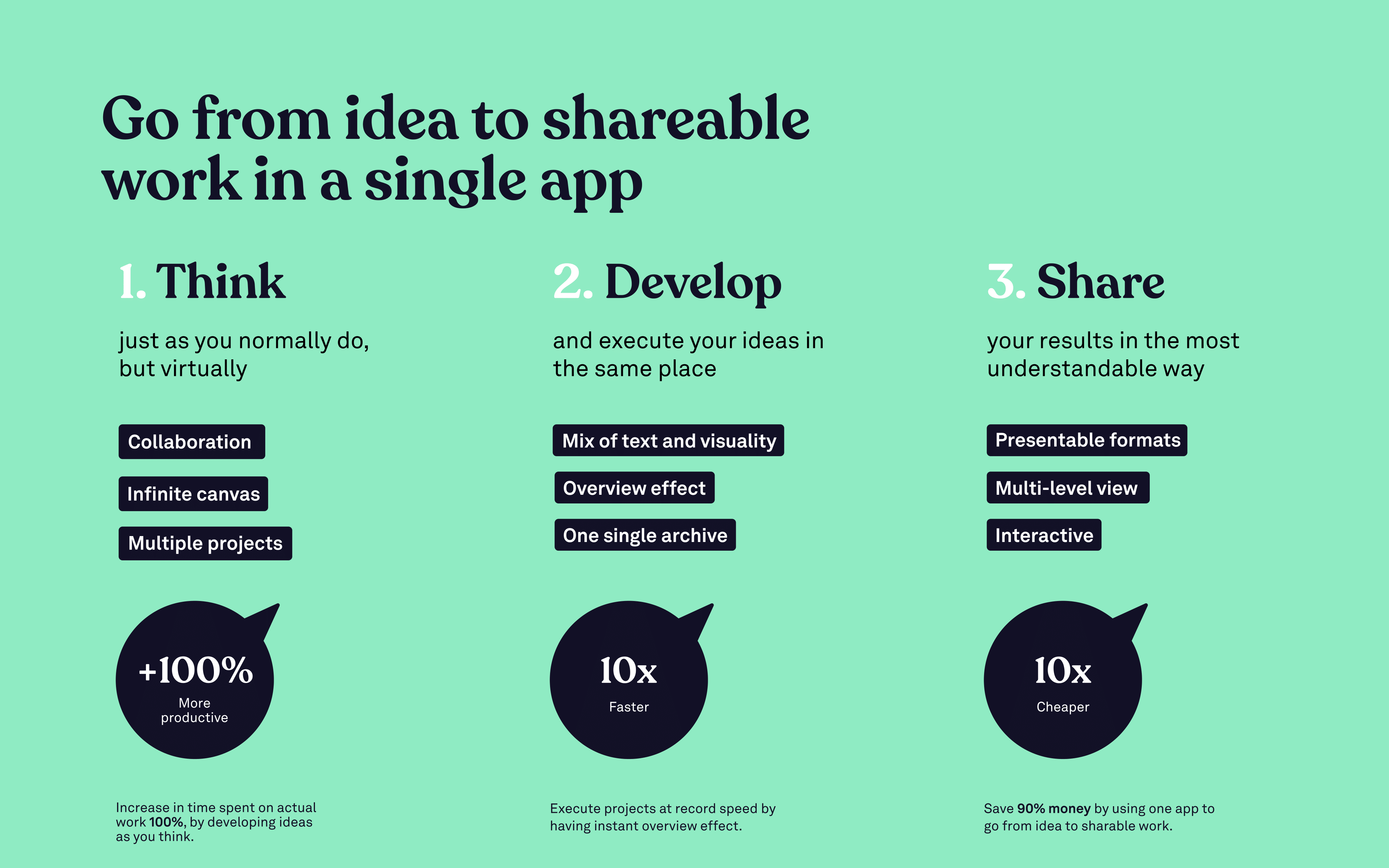
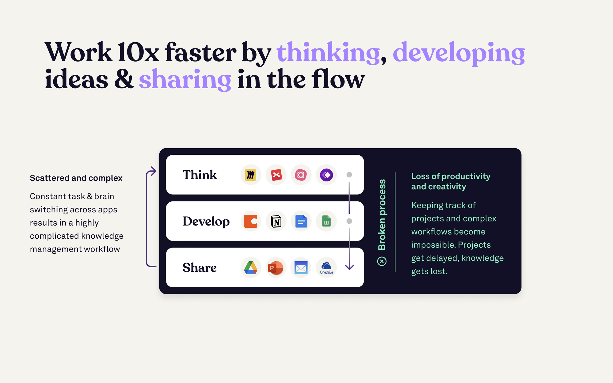
Scrintal makes a pretty bold claim here and backs it up with a mental model that resonates with investors. Everyone has been through the process of using an app for ideation, moving to another app for developing the idea further, and finally cementing the idea in another app so it can be shared.
User Testimonials
Traction
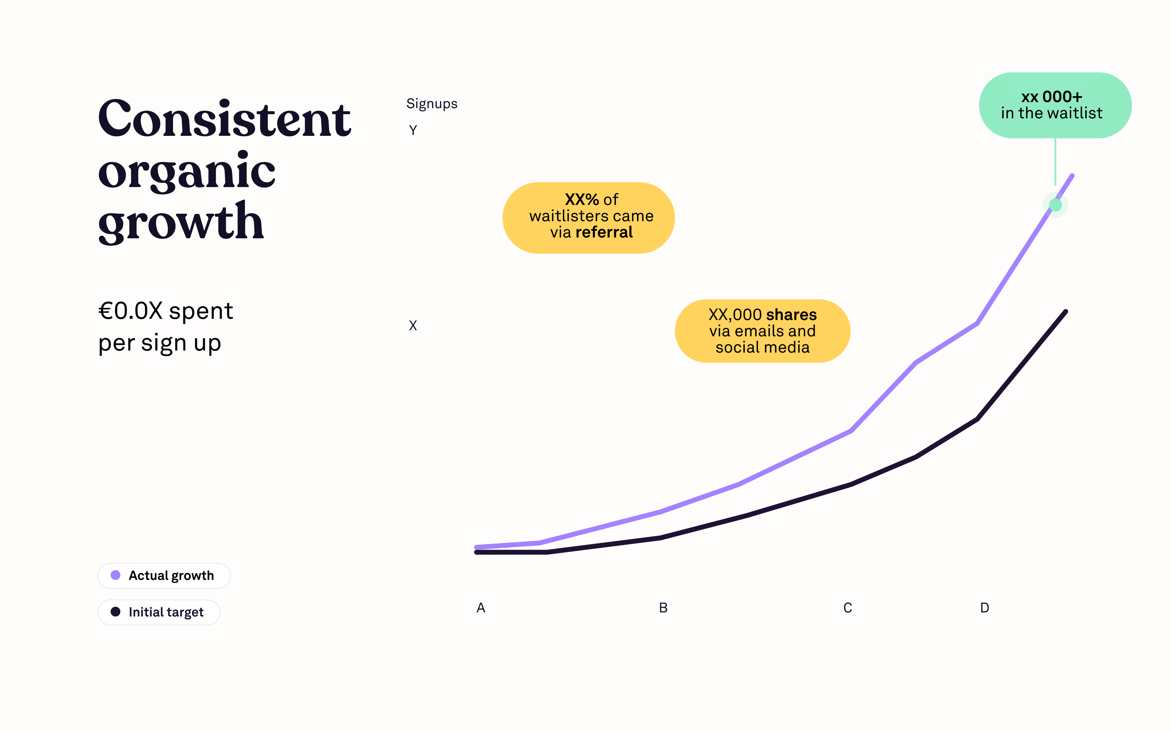
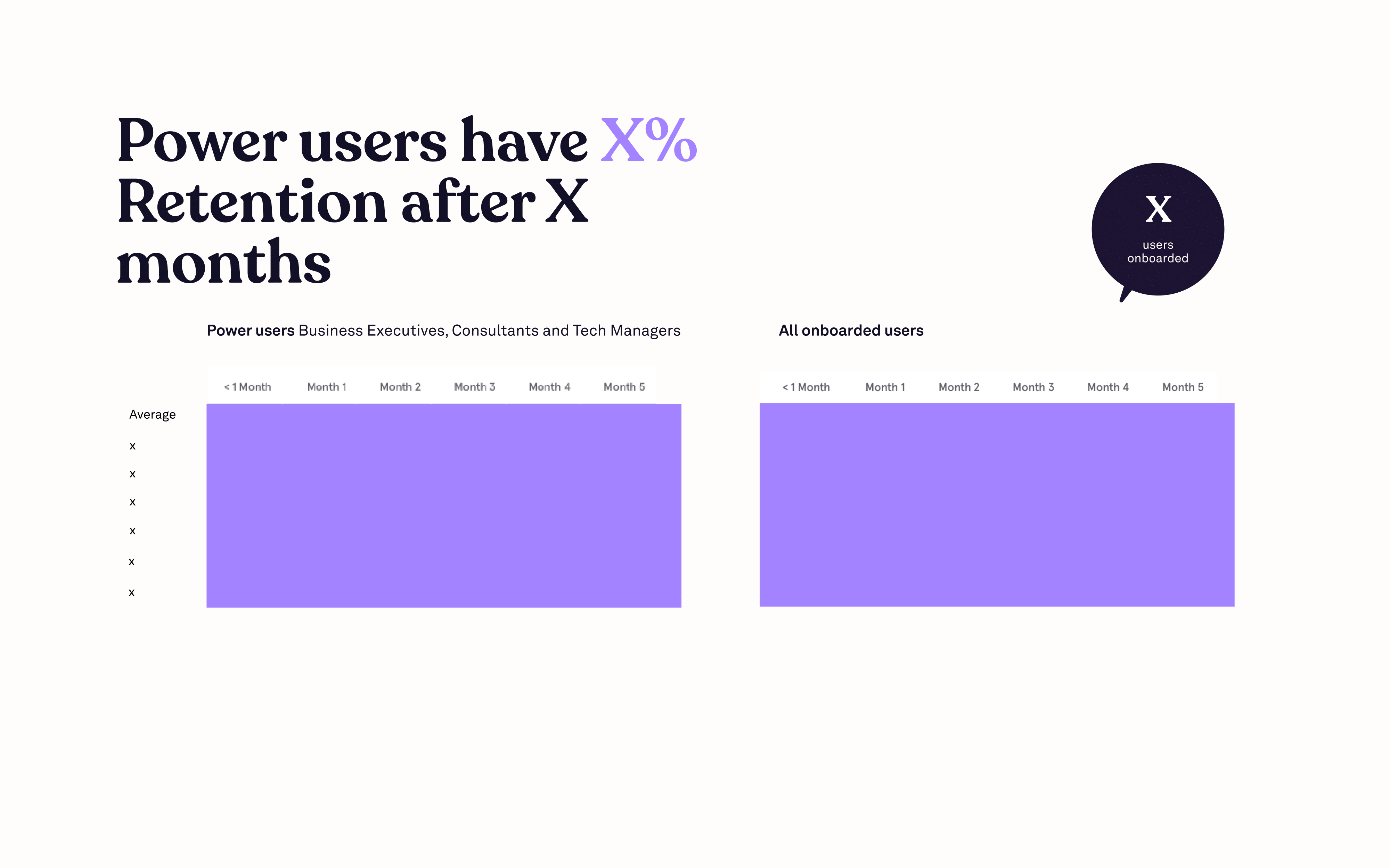
In previous pitch breakdowns (see Incymo.AI) vanity metrics have been plentiful. Scrintal does a great job pulling in relevant metrics for a consumer app through their traction, revenue growth, and retention.
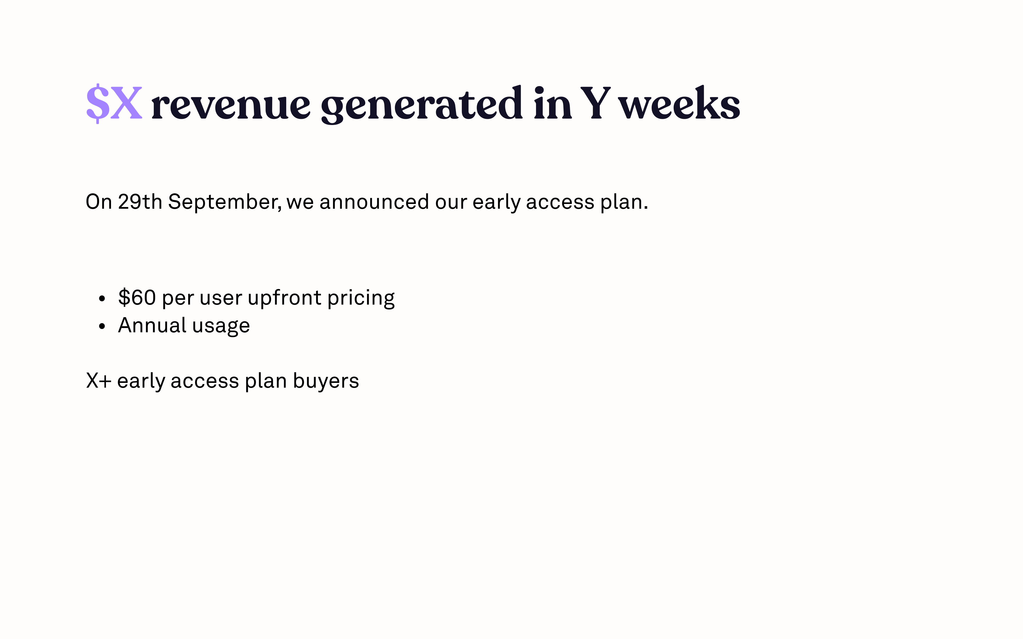
Revenue
I’ve personally been using Scrintal since it was in beta. I saw them move from beta to and early access plan. The model Scrintal chose to go from beta to revenue is likely very compelling to investors.
Retention
User Profile
Growth
Vision
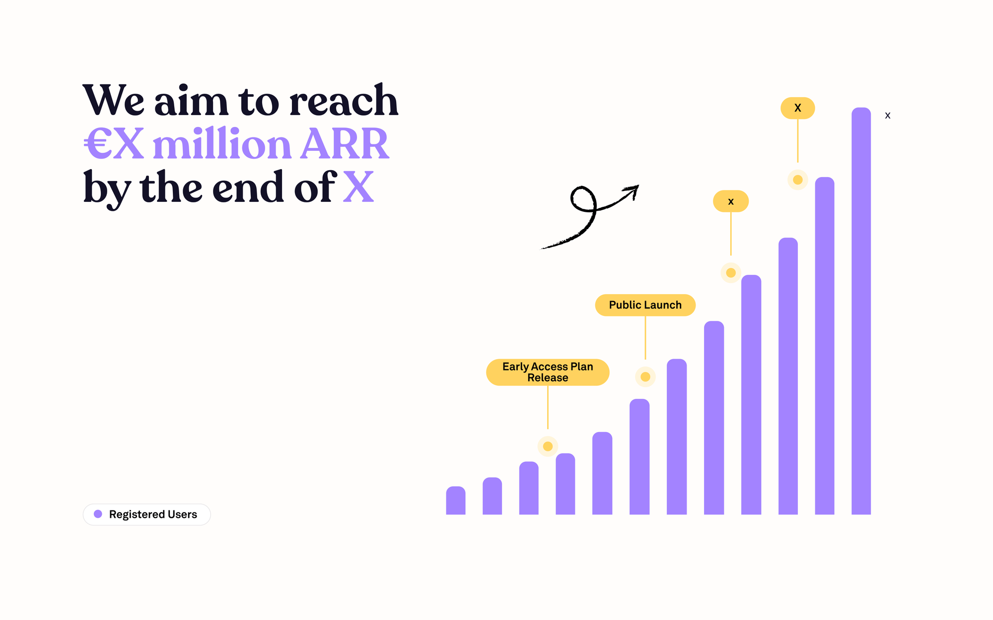
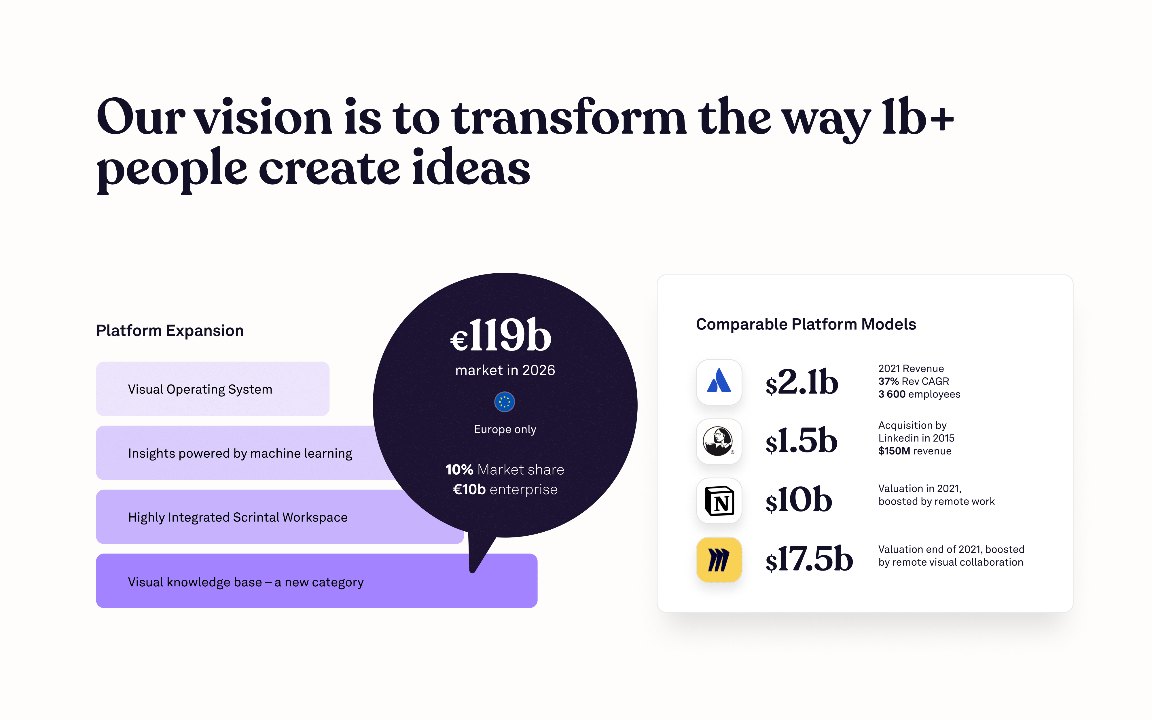
This isn’t strictly a vision slide and does a great job of pulling in the roadmap for the company and product. All the while showing some comparisons for similar valuations.
The Ask
Contact

Appendices
Personally, I think some of these slides should be in the main deck but they work in an appendix. One major slide that’s missing it the team slide. Arguably one of the most crucial slides in a seed deck. Investors are focused on 3 things in a seed round: the team, the market, and the outsized upside.

Why Now?
Competitive Landscape
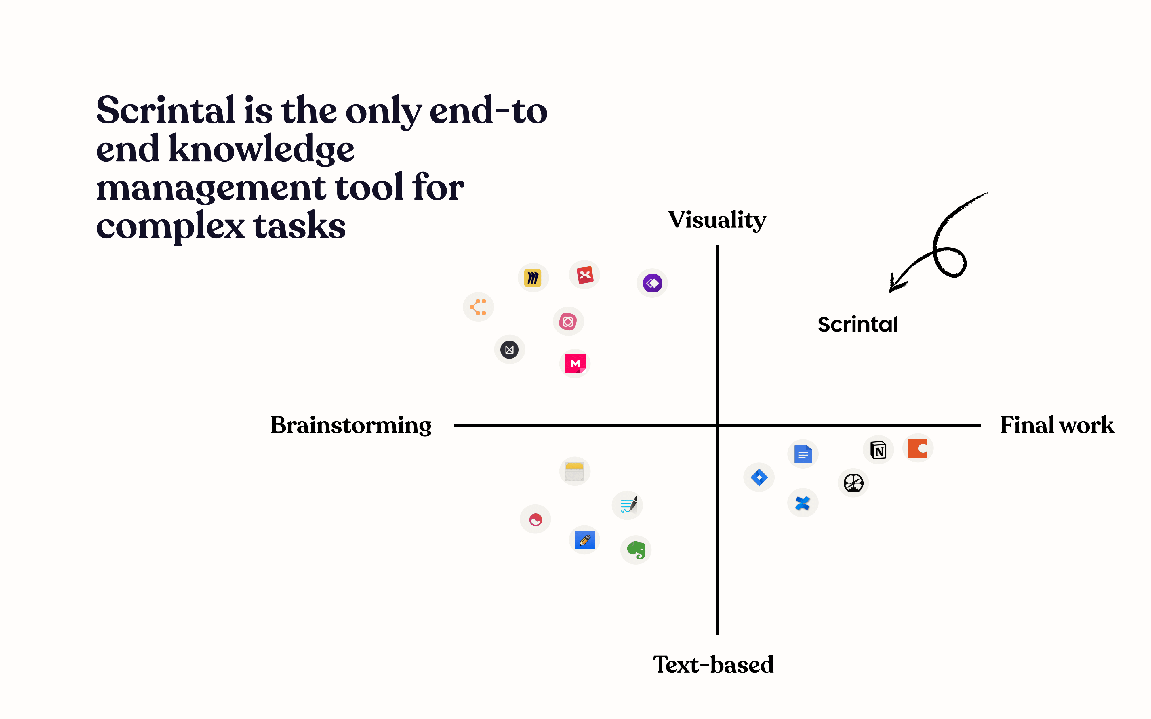
This slide leaves a bit to be desired, but does a good job pulling together a competitive landscape for investors. I’ve already covered how to develop a compelling competitive landscape but it goes without saying that it’s a common fallacy to place your product in the upper-right quadrant.
Product and Growth
